Source page: McKinsey & Company
Commentary
How may I assist you today?
Customer experience
February 4, 2022 – Across industries, live conversations between customers and customer-service agents still represent the majority of all incoming call-center volume, and projections suggest that these calls aren’t going away anytime soon. Companies that invest in capturing, extracting, and analyzing voice data have a real opportunity to substantially improve customer experience.
To read the article, see “From speech to insights: The value of the human voice,” January 21, 2022.
customizer here
Visual form
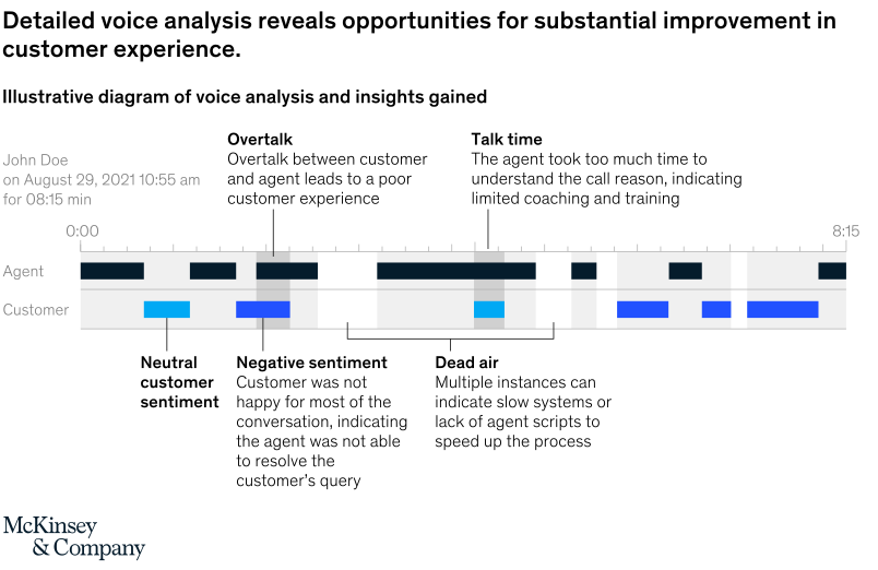
Process diagram.
Layout / body structure
The chart is laid out as a voice-analysis workflow diagram rather than a conventional chart. Reader starts with the call timeline in the center and then reads the explanatory insight boxes around it to understand how specific voice patterns translate into customer-experience findings.
What is being compared
The diagram compares different conversational signals within a customer-service call, such as overtalk, talk time, dead air, and customer sentiment. It is comparing call behaviors and showing how each behavior maps to a different type of service or coaching issue.
Measurement system
The page uses call duration and labeled event types rather than a single percentage or dollar scale. The central timeline runs from 0:00 to 8:15 and is split between agent and customer speech, while the surrounding labels classify portions of the call as neutral, negative sentiment, or dead air.
Visible structure inside the graphic
A central horizontal timeline anchors the page, with stacked or boxed callouts around it that explain what the detected voice patterns mean. One callout highlights overtalk between customer and agent, another points to extended talk time, another marks negative customer sentiment, and another isolates dead-air moments, so the whole graphic reads like an annotated analysis map of one call.
Main takeaway from the visual
Detailed voice analysis can pinpoint multiple service problems inside a single call, turning raw audio into specific improvement opportunities for customer experience. The chart makes that case by showing that poor outcomes are not one-dimensional: they can stem from confusion, excessive overlap, slow systems, lack of scripts, or failure to resolve the issue.
Key standout values or extremes
The clearest numeric anchor is the full 8:15 call duration shown on the timeline. The strongest nonnumeric extremes are the multiple flagged problem zones – overtalk, negative sentiment, and dead air – which make the call look overloaded with friction rather than containing one isolated failure point.
Controls / sequence, when applicable
This is a static chart image with no in-chart controls to operate.
Companion media, when applicable
There is no separate companion audio or video; the chart image is the full visual on this page.