Source page: McKinsey & Company
Commentary
Indexing immunity
COVID-19 | Healthcare | Public Health
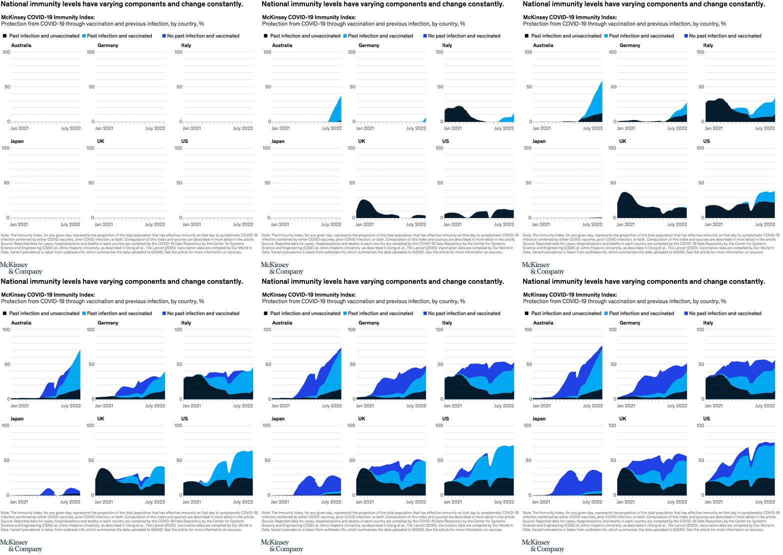
August 10, 2022 – A community’s current level of risk from COVID-19 depends, in part, on the immunity of its members. The McKinsey COVID-19 Immunity Index, a tool for understanding a community’s current level of risk, helps make a few observations. For example, analysis of immunity levels for six countries shows the emergence of Omicron during the winter of 2021–22 is visible as a sharp drop in immunity in multiple countries (since existing immunity was suddenly less effective against the new variant).
To read the article, see “When will the COVID-19 pandemic end?,” July 28, 2022.
customizer here
Visual form
Six-panel stacked area time-series chart.
Layout / body structure
The chart is arranged as a grid of six country panels: Australia, Germany, Italy, Japan, UK, and US. Each panel uses the same time axis from January 2021 to July 2022 and the same 0 to 100 percent vertical scale, so the reader compares country trajectories panel by panel instead of reading one combined line chart.
What is being compared
The chart compares national immunity levels and their components across six countries. Within each panel, the total protected share is broken into past infection and unvaccinated, past infection and vaccinated, and no past infection and vaccinated.
Measurement system
The vertical scale is percent of the population with effective immunity, and the stacked colors show how that immunity is composed. Black sits at the base for past infection and unvaccinated, cyan sits above it for past infection and vaccinated, and dark blue forms the upper band for vaccinated without past infection.
Visible structure inside the graphic
Each country panel is one continuous stacked area timeline. Australia and Germany climb steadily from near zero, Italy and the UK begin with much larger black infection-based layers, Japan stays low for much longer before rising, and the US panel shows one of the deepest mid-period troughs before recovering to the highest overall level by the right edge.
Main takeaway from the visual
The chart shows that immunity is not only uneven across countries but also constantly changing in composition. Several panels show a visible drop during the Omicron period, where the total stack dips before climbing again, which makes the index look dynamic rather than cumulative in a straight line.
Key standout values or extremes
By the right edge, Australia rises to roughly the 70 percent range, Germany sits around the 50 percent range, Italy around the mid-50s, Japan around the low 30s, the UK around the upper 50s, and the US reaches roughly the low 70s. Japan is the lowest end-state panel, while the US and Australia finish highest, and the US also shows one of the sharpest visible immunity drops before rebounding.
Controls / sequence, when applicable
This is a static chart image with no in-chart controls to operate.
Companion media, when applicable
There is no separate companion audio or video; the chart image is the full visual on this page.