Source page: McKinsey & Company
Commentary
Is that covered?
Healthcare | North America | Diversity & Inclusion
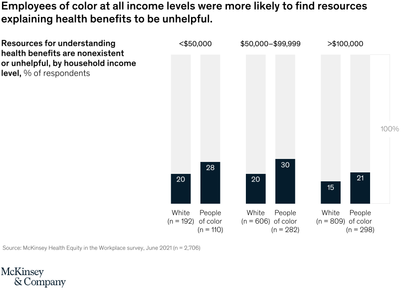
January 31, 2022 – Our survey of 3,000 US workers finds that diverse employees at all income levels are more likely to say they do not qualify for or are not sure if they qualify for major benefits, such as health insurance, ancillary insurance, employee assistance programs, leave policies, and wellness benefits. A big problem is communication: when companies partner with vendors such as insurers to make benefits easy to understand and navigate, employees are more likely to receive the care they need.
To read the article, see “Income alone may be insufficient: How employers can help advance health equity in the workplace,” December 3, 2021.
customizer here
Visual form
Paired 100 percent stacked column chart.
Layout / body structure
The chart is arranged as three income brackets across the page, and each bracket contains a pair of vertical columns for White respondents and people of color. Reader moves left to right by income level and, within each bracket, compares the two race-group columns side by side.
What is being compared
The chart compares the share of respondents who say resources for understanding health benefits are nonexistent or unhelpful. It compares that response across race grouping and across three household-income bands.
Measurement system
Each column is normalized to 100 percent, with the dark lower segment showing the share who found the resources nonexistent or unhelpful and the pale upper segment representing everyone else. The labels above the groups show the income bands, and the base labels include sample sizes for each respondent group.
Visible structure inside the graphic
There are six total columns: two for incomes below $50,000, two for $50,000 to $99,999, and two for incomes above $100,000. The dark segments are directly labeled 20 and 28 in the lowest bracket, 20 and 30 in the middle bracket, and 15 and 21 in the highest bracket.
Main takeaway from the visual
People of color are shown as more likely than White respondents to find benefit-navigation resources unhelpful at every income level. The gap does not disappear as income rises, so the chart reads as a persistent access-and-clarity disparity rather than a low-income-only problem.
Key standout values or extremes
The widest gap appears in the $50,000 to $99,999 bracket, where people of color are at 30 percent versus 20 percent for White respondents. The other two brackets show 28 versus 20 below $50,000 and 21 versus 15 above $100,000.
Controls / sequence, when applicable
This is a static chart image with no in-chart controls to operate.
Companion media, when applicable
There is no separate companion audio or video; the chart image is the full visual on this page.