Source page: McKinsey & Company
Commentary
Ladies and gentlemen, start your engines
Banking
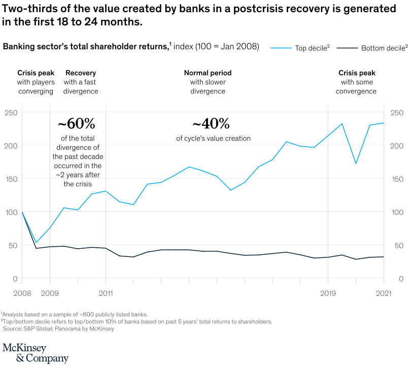
February 14, 2022 – With disruption comes opportunity, especially for those that can move quickly. Since the 2008 global financial crisis, the gap between banking’s leaders and followers widened. By 2019, top-decile performers were delivering about five times more value to their shareholders than the bottom decile (and three times more than the average bank). Critically, about 60 percent of the performance gap occurred during the first two years of recovery (2010 and 2011). During the remainder of the decade, the gap continued to widen, but more slowly. Our annual review explains why speed is essential as we near the end of the pandemic.
To read the report, see “McKinsey’s Global Banking Annual Review,” December 1, 2021.
customizer here
Visual form
Two-series time-series line chart.
Layout / body structure
The chart is one long line chart with the crisis and recovery periods marked directly on the page. Reader moves left to right from the 2008 crisis peak through the early-recovery window and into the later normal period while comparing the top-decile and bottom-decile bank lines on the same axis.
What is being compared
The chart compares total shareholder returns for the top decile and bottom decile of banks during a postcrisis cycle. It is comparing performance groups across time and tying that comparison to the speed with which value creation emerges after a crisis.
Measurement system
The vertical measure is indexed total shareholder returns with 100 set to January 2008. The chart therefore tracks relative performance growth rather than raw dollar returns, and the horizontal axis runs from the crisis year into the recovery years through 2021.
Visible structure inside the graphic
Two lines run across the chart, one for the top decile and one for the bottom decile, with the chart segmented into crisis peak, recovery, and normal-period phases. The page also adds large callouts showing that about 60 percent of the cycle’s value creation and roughly 40 percent of the past decade’s divergence occurred in the first two years after the crisis.
Main takeaway from the visual
The chart shows that the fastest and largest share of bank value creation in a recovery arrives early, and that performance gaps between stronger and weaker banks open up quickly. The widening distance between the two lines during the early-recovery stretch is what makes the page feel like a race out of the crisis rather than a slow, even climb.
Key standout values or extremes
The two big anchors on the page are the roughly 60 percent share of total cycle value creation and the roughly 40 percent share of decade-long divergence that show up in the first 18 to 24 months. The indexed scale also reaches into the 200-plus range for the strongest performers, while the weaker line stays materially lower.
Controls / sequence, when applicable
This is a static chart image with no in-chart controls to operate.
Companion media, when applicable
There is no separate companion audio or video; the chart image is the full visual on this page.