Source page: McKinsey & Company
Commentary
Mapping public transportation’s pain points
Travel & Transportation
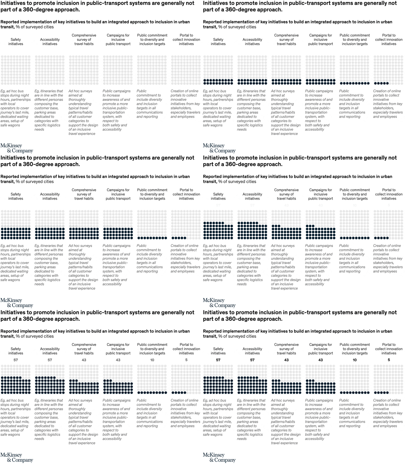
March 18, 2022 – For members of at-risk groups, using public transportation can be a stressful and scary experience. In our global survey of more than 20 different public-transport operators, we found that while there are many initiatives to enhance inclusion, they are typically not part of an integrated, 360-degree approach. Implementing safety and accessibility initiatives are key ways to improving urban transit systems around the world.
To read the article, see “Fostering an inclusive urban transit system,” February 16, 2022.
customizer here
Visual form
Six-column initiative comparison chart with explanatory callouts.
Layout / body structure
The chart is organized as six vertical columns on a single page, each headed by an initiative name, a bold percentage, and a block of explanatory text below. Reader moves left to right across the six initiative cards, using the percentage at the top of each column as the quick comparison anchor before dropping into the examples underneath.
What is being compared
The chart compares how often surveyed cities report implementing different inclusion-oriented public-transport initiatives. The columns cover safety initiatives, accessibility initiatives, comprehensive surveys of travel habits, campaigns for inclusive public-transport initiatives, public commitment to diversity and inclusion targets, and portals for collecting innovation initiatives.
Measurement system
The measure is the percent of surveyed cities reporting implementation of each initiative type. Each column uses one bold percentage as its headline value, so the reader compares prevalence across initiatives rather than tracking a time trend or an index.
Visible structure inside the graphic
The six columns are parallel cards with short category headings at the top and dense explanatory examples underneath, which makes the chart read partly like a scorecard and partly like a reference table. The values sit above the text blocks, and the examples spell out what each initiative looks like in practice, from dedicated waiting areas and safe wagons to online innovation portals and public campaigns.
Main takeaway from the visual
The chart shows that inclusion efforts are present, but scattered rather than comprehensive. Safety and accessibility measures are among the most common visible categories, while explicit public commitment to diversity and inclusion targets is much rarer, which supports the headline claim that cities are not approaching inclusion as a full 360-degree system.
Key standout values or extremes
The strongest visible percentages are 57 percent for safety initiatives and 57 percent for accessibility initiatives. Comprehensive surveys of travel habits and campaigns for inclusive public transport both sit at 43 percent, while public commitment to diversity and inclusion targets is just 10 percent, the clearest low point on the page.
Controls / sequence, when applicable
This is a static chart image with no in-chart controls to operate.
Companion media, when applicable
There is no separate companion audio or video; the chart image is the full visual on this page.