Source page: McKinsey & Company
Commentary
Pain in the boat
Logistics | Supply Chain Management | COVID-19
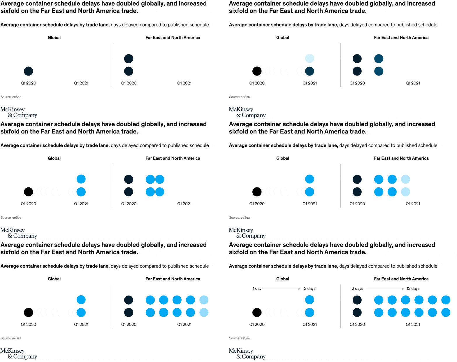
May 6, 2022 – The shipping industry continues to feel the effects of pandemic lockdowns, labor shortages, and demand for goods. In late 2021, container schedule delays doubled globally and increased sixfold for countries in the Far East and North America compared with the average in early 2020.
To read the article, see “Navigating the current disruption in containerized logistics,” March 14, 2022.
customizer here
Visual form
Two-panel dot-matrix comparison.
Layout / body structure
The chart is split into a global panel on the left and a Far East and North America panel on the right. Read each panel left to right from the early quarter to the later quarter, using the number of dots as the core visual measure of schedule delay.
What is being compared
The graphic compares average container schedule delays by trade lane at two points in time. It compares Q1 2020 with Q1 2021 for global shipping on the left and for the Far East and North America lane on the right.
Measurement system
The measurement is days delayed compared to the published schedule, translated into dot counts rather than bars. In the global panel one black dot stands for one day and two blue dots stand for two days, while in the Far East and North America panel two black dots stand for two days and twelve blue dots stand for twelve days.
Visible structure inside the graphic
Each panel uses large filled circles in horizontal rows, so the increase in delay shows up as a jump in the number of dots rather than in bar length. The left panel is intentionally sparse, while the right panel becomes a dense block of blue circles, which makes the regional shock immediately more dramatic than the global average.
Main takeaway from the visual
Container delays worsened everywhere, but the Far East and North America route deteriorated much more sharply than the global average. The global panel merely doubles from one dot to two, while the regional panel explodes from two dots to twelve, making the trade-lane disruption look far more severe on that corridor.
Key standout values or extremes
Globally, average schedule delay rises from 1 day in Q1 2020 to 2 days in Q1 2021. On the Far East and North America lane, the average delay rises from 2 days to 12 days, which is the single biggest numeric jump on the page and the reason the right panel visually overwhelms the left.
Controls / sequence, when applicable
This is a static chart image with no in-chart controls to operate.
Companion media, when applicable
There is no separate companion audio or video; the chart image is the full visual on this page.