Source page: McKinsey & Company
Commentary
People who see people: How high mixers help spread COVID-19
COVID-19 | Public Health
April 6, 2021 – Some people interact with many others in the course of a day; others see very few. Sounds basic, but it’s a critical distinction, often overlooked in epidemiological models, and may explain the sharp rise and recent fall in US COVID-19 cases.
To read more, see “All in the mix: Why US COVID-19 cases rose and fell, and what comes next,” March 29, 2021.
customizer here
Visual form
Two-panel network comparison diagram.
Layout / body structure
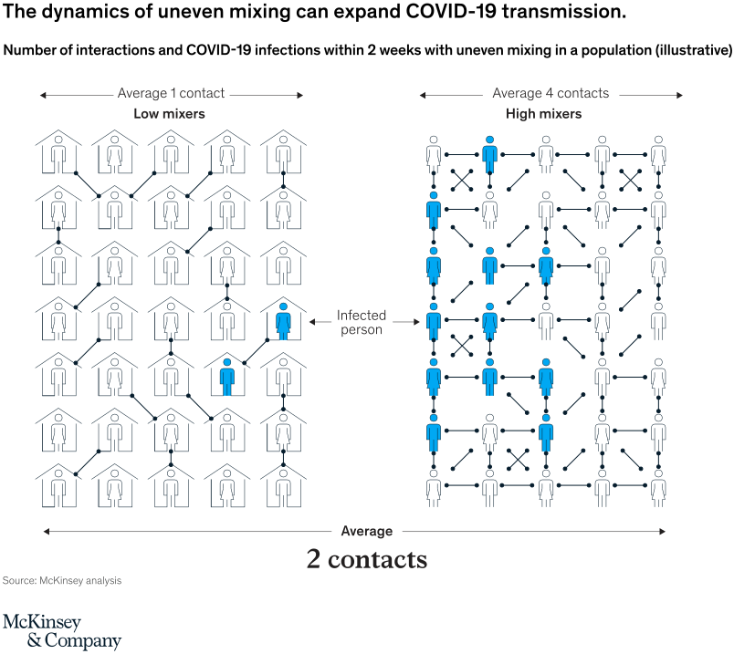
The chart places a low-mixers panel on the left and a high-mixers panel on the right, each built from a grid of household icons connected by lines. Reader compares the density of connections and highlighted infected people across the two panels while using the shared average-of-two-contacts note at the bottom as the common baseline.
What is being compared
It compares two different patterns of social mixing in a population: a low-mixing scenario in which people average one contact and a high-mixing scenario in which people average four contacts. In both panels, the chart tracks how uneven mixing changes infection spread over a two-week period.
Measurement system
The chart is illustrative rather than numeric in the usual chart sense. The key labeled anchors are average 1 contact on the low-mixers side, average 4 contacts on the high-mixers side, and an overall average of 2 contacts across the full population, with highlighted blue figures showing infected people.
Visible structure inside the graphic
Both sides use the same house-and-person lattice, but the left panel has relatively sparse links while the right panel is packed with many more crossing and vertical connections. The blue infected figures multiply much more heavily on the right, making the transmission effect legible through network density rather than through bars or lines.
Main takeaway from the visual
Uneven mixing can expand transmission even when the average number of contacts across the whole population is the same. The right-hand high-mixers panel turns much more of the population blue, which makes concentrated contact patterns look far more dangerous than the simple average alone would suggest.
Key standout values or extremes
The left panel is anchored at average 1 contact and shows only a few infected people, while the right panel is anchored at average 4 contacts and shows a much larger cluster of blue figures spread through the network. The full chart emphasizes that both sides still roll up to an average of 2 contacts overall, underscoring that distribution matters as much as the mean.
Controls / sequence, when applicable
This is a static chart image with no in-chart controls to operate.
Companion media, when applicable
There is no separate companion audio or video; the chart image is the full visual on this page.