Source page: McKinsey & Company
Commentary
“Productivity isn’t everything, but in the long run, it’s <em>almost</em> everything.”
Economic Development | Productivity | North America
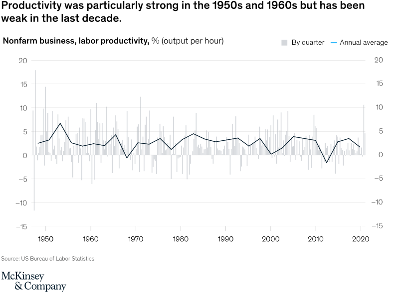
February 16, 2021 – Economist and New York Times columnist Paul Krugman’s aphorism remains apt for a US economy looking to rebuild. The years after WWII are particularly instructive, when productivity grew 2.8 percent a year from 1947 to 1973. Our new memo looks deeply into the postwar period to find ideas about how to boost productivity now.
To read the article, see “America 2021: Rebuilding lives and livelihoods after COVID-19,” February 16, 2021.
customizer here
Visual form
Long-run time-series chart combining quarterly bars and an annual-average line.
Layout / body structure
The chart is one wide historical chart running from the late 1940s to 2020. Reader follows the pale quarterly bars first as the noisy underlying series and then uses the darker line to trace the smoother annual-average pattern across decades.
What is being compared
It compares quarter-by-quarter and annual-average nonfarm-business labor productivity growth in the United States across the postwar period, emphasizing how recent productivity compares with earlier decades.
Measurement system
The measure is percent output per hour. The vertical axis ranges from about minus 15 to plus 20 percent, the bars show quarterly changes, and the dark line shows the annual average.
Visible structure inside the graphic
Thin light-gray vertical bars create a dense, volatile background series, while the black line threads through the middle as the long-run guide. The line peaks much higher in the early postwar decades, flattens into moderate gains through much of the later century, and dips below zero briefly around the 2010s before recovering modestly near 2020.
Main takeaway from the visual
Productivity growth was much stronger in the mid-twentieth century than it has been recently. The annual-average line sits materially higher in the 1950s and 1960s and never regains those levels in the weak-growth decade leading into 2020.
Key standout values or extremes
The annual-average line rises above 5 percent in the early 1950s, spends much of the later period closer to roughly 2 to 4 percent, and briefly drops below zero in the 2010s before returning to the low single digits. The quarterly bars show the widest volatility at the extremes, with spikes above 15 percent and drops below minus 10 percent, especially early in the series.
Controls / sequence, when applicable
This is a static chart image with no in-chart controls to operate.
Companion media, when applicable
There is no separate companion audio or video; the chart image is the full visual on this page.