Source page: McKinsey & Company
Commentary
Rearranging the trade deck
Global Trade | China
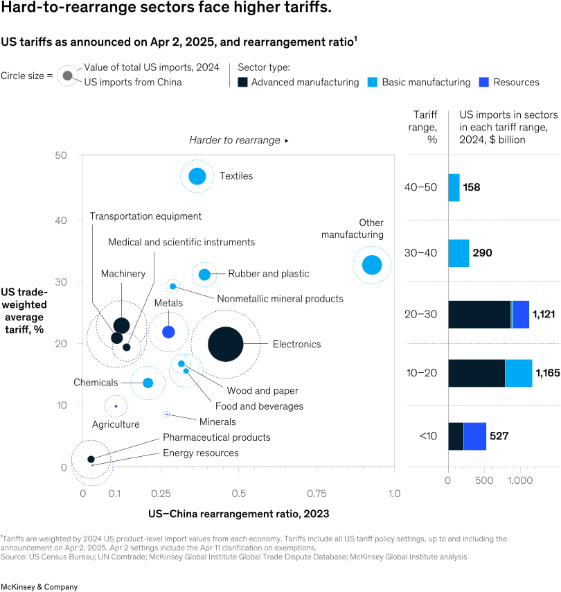
August 6, 2025 – Global trade is undergoing significant change. Senior Partner Sven Smit and coauthors use a “rearrangement ratio” to gauge the feasibility of shifting US imports away from China. A high ratio indicates difficulty and a low ratio indicates easier substitution. They found that basic manufacturing sectors have higher US–China rearrangement ratios, since China is a major supplier and the United States is an outsize buyer. Therefore, tariff pressure to rearrange trade is likely to be higher in sectors that are the most difficult to rearrange.
To read the article, see “The great trade rearrangement,” June 25, 2025.
customizer here
Visual form
Bubble scatter plot paired with a tariff-range summary bar table.
Layout / body structure
The chart has two linked parts read left to right. The left panel is a scatter plot of sectors positioned by rearrangement ratio and trade-weighted tariff, and the right panel groups U.S. imports by tariff range in stacked horizontal bars.
What is being compared
The left side compares sectors such as electronics, textiles, transportation equipment, medical and scientific instruments, machinery, chemicals, agriculture, minerals, energy resources, and pharmaceuticals by how easy U.S.-China trade is to rearrange and by the tariffs those sectors face. The right side compares the total value of U.S. imports that fall into each tariff band.
Measurement system
The x-axis is the U.S.-China rearrangement ratio for 2023, the y-axis is the U.S. trade-weighted average tariff in percent, and bubble size represents the value of total U.S. imports in 2024, with a dotted inner ring indicating U.S. imports from China. Color encodes sector type: advanced manufacturing, basic manufacturing, and resources. The right panel uses billions of dollars for the tariff-band totals.
Visible structure inside the graphic
On the left, labeled bubbles are scattered across the chart, with a harder-to-rearrange arrow pointing toward the upper-right area. Electronics is the largest bubble near the middle-right, textiles sits very high on tariffs near the top, and other manufacturing appears far to the right with both high tariff and high rearrangement ratio. On the right, horizontal bars summarize import value in tariff bands such as under 10 percent, 10 to 20, 20 to 30, 30 to 40, and 40 to 50.
Main takeaway from the visual
The chart shows that the sectors facing the highest tariffs are often the ones that are hardest to rearrange quickly, which is why the upper part of the scatter contains several important manufacturing sectors rather than only small fringe categories.
Key standout values or extremes
Textiles sits near the top of the tariff scale at roughly 47 percent. Other manufacturing is also high at about 33 percent and very far right on rearrangement ratio near 0.9. Electronics carries the biggest import bubble around a 20 percent tariff and a midrange rearrangement ratio near 0.45. On the right panel, the 10 to 20 percent and 20 to 30 percent tariff bands contain the largest import values at 1,165 and 1,121 billion dollars, respectively.
Controls / sequence, when applicable
This is a static chart image with no in-chart controls to operate.
Companion media, when applicable
There is no separate companion audio or video; the chart image is the full visual on this page.