Source page: McKinsey & Company
Commentary
Risk abounds. How ready are companies?
Banking | Risk
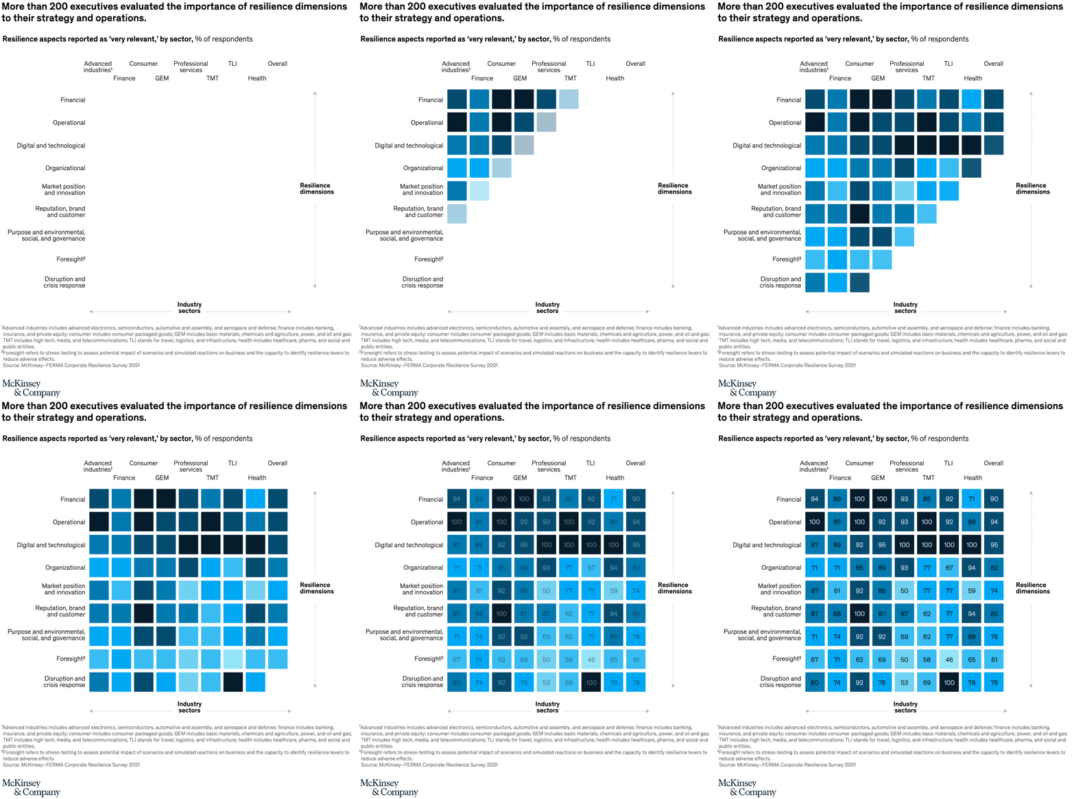
March 25, 2022 – We asked European leaders in eight industries about the relevance of various risk types and other characteristics to their companies. They gave a slight nod to digital and technological risk over other types. And most agreed that their foresight capabilities, through techniques such as scenario planning, could use improvement.
To read the article, see “Financial institutions and nonfinancial risk: How corporates build resilience,” February 28, 2022.
customizer here
Visual form
Percentage heatmap matrix.
Layout / body structure
The chart is a dense rectangular grid of percentage cells arranged in rows and columns on one page. Reader scans across each row and then moves downward, using both the printed numbers and the cell color intensity to compare how preparedness changes from one intersection in the matrix to the next.
What is being compared
The chart compares many risk-readiness intersections across a matrix of risk topics and preparedness dimensions. It is not a time series or a single ranking; it is a many-to-many readiness comparison that shows where companies appear more prepared and where readiness drops away.
Measurement system
Each cell is a percentage score, with darker blue cells representing higher readings and lighter blue cells representing lower ones. The printed percentages inside the squares are the exact anchors, so the reader can track both the numeric level and the visual intensity at the same time.
Visible structure inside the graphic
The whole page is organized as a field of equally sized square cells separated by white gutters. Some stretches cluster into very dark rows of 89, 92, 95, and multiple 100 scores, while lighter cells such as 50, 59, 61, 62, 67, 69, 71, 74, and 77 break up that dark field and create visible pockets of weaker readiness.
Main takeaway from the visual
The matrix shows that readiness is high in many places but far from uniform. The repeated dark cells suggest several areas of strong preparedness, yet the lighter cells are scattered throughout the grid instead of being isolated to one corner, which makes the chart read as uneven readiness rather than blanket confidence.
Key standout values or extremes
The strongest visible scores are the repeated 100 values and nearby 95, 94, and 92 cells. The weakest visible point is 50, and other low pockets at 59, 61, 62, 67, 69, 71, 74, and 77 stand out because they are surrounded by much darker, higher-percentage squares.
Controls / sequence, when applicable
This is a static chart image with no in-chart controls to operate.
Companion media, when applicable
There is no separate companion audio or video; the chart image is the full visual on this page.