Source page: McKinsey & Company
Commentary
Spreadsheet jockeys, hang up your spurs
Supply Chain Management | Technology
March 16, 2022 – Even before congested ports and parts and labor shortages began to snarl supply chains in 2020, companies needed to update their supply-chain technology. They haven’t done themselves any favors by clinging to manual systems and antiquated software, including one widely used application that’s so old the provider will soon stop supporting it.
To read the article, see “To improve your supply chain, modernize your supply-chain IT,” February 9, 2022.
customizer here
Visual form
Category comparison bar chart.
Layout / body structure
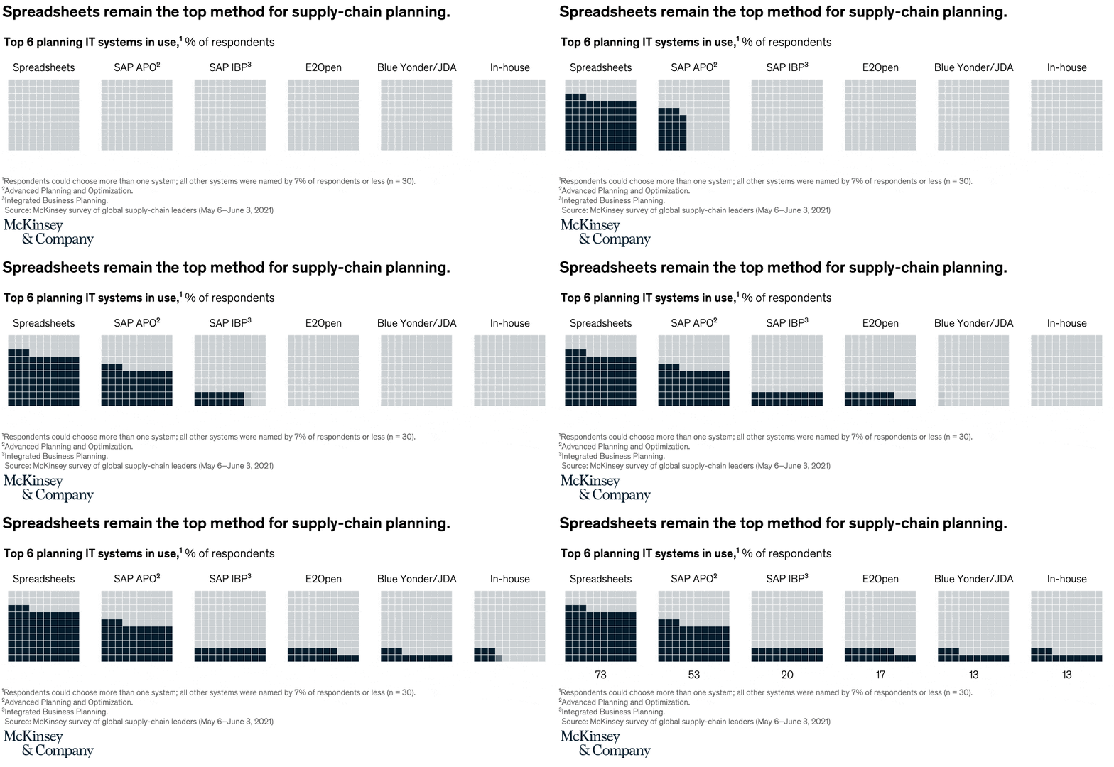
The chart places the top planning IT systems in one horizontal sequence, with one bar per system and the percentage printed alongside the category. Reader scans across the six named systems and immediately sees one dominant bar followed by a cluster of much shorter alternatives.
What is being compared
The chart compares the planning IT systems supply-chain respondents say they use, including spreadsheets, SAP APO, SAP IBP, E2open, BlueYonder or JDA, and in-house systems. It is a tool-adoption comparison across system categories rather than a performance or time comparison.
Measurement system
The measure is percent of respondents, and the note on the chart says respondents could choose more than one system. That means the bars reflect usage prevalence by system rather than exclusive market share, and the printed percentages are the main anchors for comparing adoption levels.
Visible structure inside the graphic
The systems are arranged as separate category bars with their values called out individually, and the footnote underneath clarifies that all other systems were named by 7 percent of respondents or less. The dominant spreadsheet bar sits far apart from the rest visually, while the named packaged tools bunch together in a low-teen to low-20 range.
Main takeaway from the visual
The chart makes spreadsheets look overwhelmingly dominant in supply-chain planning compared with every named modern system on the page. The gap between the spreadsheet value and the rest is so wide that the chart reads less like a close race and more like a legacy-tool warning sign.
Key standout values or extremes
Spreadsheets lead at 73 percent, far ahead of SAP APO at 20 percent and SAP IBP at 17 percent. E2open and in-house systems are both shown at 13 percent, and the note says all other systems are at 7 percent or lower, reinforcing how concentrated the page is around the spreadsheet bar.
Controls / sequence, when applicable
This is a static chart image with no in-chart controls to operate.
Companion media, when applicable
There is no separate companion audio or video; the chart image is the full visual on this page.