Source page: McKinsey & Company
Commentary
The disconnect between AI spend and potential
Artificial Intelligence | Generative AI | Workplace
March 6, 2025 – Workers are adopting AI technology faster than many of their leaders realize. This finding is one of several highlighted in McKinsey’s latest report, Superagency in the Workplace. All this week, our data visualizations will focus on themes from this report, such as employee enthusiasm for AI and the technology’s economic potential. For more, see the report.
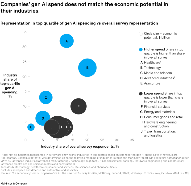
Although almost all companies invest in AI, their spend doesn’t fully align with the economic potential in their industries, say Senior Partner Lareina Yee and coauthors. For example, the consumer industry has the second-highest potential for value realization from AI but appears to be least willing to invest among the top 25 percent of spenders, based on self-reported percentage of revenue spend in a McKinsey survey. This might be due to the industry’s low average net margins in mass-market categories leading to higher confidence thresholds for adopting expensive, organization-wide technology upgrades.
To read the report, see “Superagency in the workplace: Empowering people to unlock AI’s full potential,” January 28, 2025.
customizer here
Visual form
Bubble scatter plot.
Layout / body structure
The chart is a single scatter chart with the explanatory legend and industry key set on the right. Read the horizontal axis first for industry share of overall survey respondents, then the vertical axis for share in the top-quartile gen-AI-spending group, and finally use bubble size and color to interpret economic potential and over- versus under-spend positioning.
What is being compared
It compares industries on two shares at once: how much of the overall survey they represent and how much of the top-quartile gen-AI-spending group they represent. Bubble color adds a higher-spend versus lower-spend classification, and bubble size adds a third comparison for estimated economic potential in billions of dollars.
Measurement system
Both axes are percentages, while bubble size represents economic potential measured in billions of dollars. The right-side legend distinguishes industries whose spend share is higher than their survey share from those whose spend share is lower.
Visible structure inside the graphic
The chart is organized as lettered bubbles scattered across the plot, with a compact legend and industry lookup list translating the letters into sector names. Blue bubbles sit above the implied parity line of equal representation, while darker bubbles cluster lower when top-quartile spend trails the industry’s overall presence in the survey.
Main takeaway from the visual
The visual shows a mismatch between where companies are spending most aggressively on gen AI and where the broader economic potential appears to sit. Healthcare and technology are visibly overrepresented among top spenders, while several industries with meaningful economic potential sit below that relative-spend threshold.
Key standout values or extremes
Healthcare sits highest on the vertical axis at a little above 30 percent while occupying only about 13 percent of overall respondents, and technology also stands out high at roughly 23 percent on the spend axis versus about 20 percent on the respondent axis. Financial services carries one of the largest dark bubbles near the middle-right of the chart, signaling large economic potential but lower relative representation among top-quartile spenders.
Controls / sequence, when applicable
This is a static chart image with no in-chart controls to operate.
Companion media, when applicable
There is no separate companion audio or video; the chart image is the full visual on this page.