Source page: McKinsey & Company
Commentary
The price of civilization
Sustainability
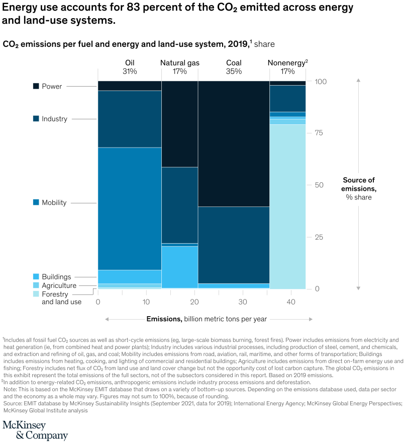
February 3, 2022 – As the scientist Amory Lovins once observed, people don’t want energy; they want hot showers and cold beer. But basic pleasures come at a price in carbon dioxide emissions. CO2 is emitted when we burn fossil fuels (oil, gas, and coal) to produce energy, as well as in nonenergy processes (such as deforestation, or the reduction of iron ore to make steel). Based on current accounting methodologies, energy production makes up about 83 percent of CO2 emissions.
To read the article, see “The net-zero challenge: Accelerating decarbonization worldwide,” January 25, 2022.
customizer here
Visual form
Segmented emissions comparison chart.
Layout / body structure
The chart combines a fuel-share strip across the top with a lower chart that allocates emissions across energy and land-use systems. Reader takes in the fuel split first and then moves down into the sector view to see where those emissions sit across power, industry, mobility, buildings, agriculture, forestry, and land use.
What is being compared
The chart compares carbon-dioxide emissions by both fuel source and emitting system. It shows how oil, natural gas, coal, and nonenergy sources contribute to total emissions and then maps those emissions across the major sectors of the economy and land-use system.
Measurement system
The lower horizontal axis is measured in billions of metric tons of emissions per year, while the top strip expresses fuel shares as percentages of total emissions. The page explicitly frames energy use as 83 percent of CO₂ across energy and land-use systems, which is the headline numerical anchor for the whole chart.
Visible structure inside the graphic
The top of the page shows a four-part fuel split labeled 31 percent for oil, 17 percent for natural gas, 35 percent for coal, and 17 percent for nonenergy sources. Below that, the sector chart uses stacked or segmented areas to show how those emissions are distributed across power, industry, mobility, buildings, agriculture, and forestry and land use on a 10-to-40 billion metric ton range.
Main takeaway from the visual
Most emissions are tied to energy use, and the sector distribution underneath shows that power, industry, and mobility occupy the largest part of the emissions system. The visual structure makes the 83 percent energy-use share feel concrete because the lower chart shows how broadly that burden is spread across the core energy-consuming sectors.
Key standout values or extremes
The strongest numbers on the page are the 83 percent headline share and the top-strip fuel mix of 31 percent oil, 17 percent natural gas, 35 percent coal, and 17 percent nonenergy. Coal is the largest single fuel slice in that top comparison, while the lower chart stretches to about 40 billion metric tons per year on its emissions scale.
Controls / sequence, when applicable
This is a static chart image with no in-chart controls to operate.
Companion media, when applicable
There is no separate companion audio or video; the chart image is the full visual on this page.