Source page: McKinsey & Company
Commentary
Too many Black Americans live in food deserts
Diversity & Inclusion | Food | North America
September 9, 2021 – In majority-Black communities, the prevalence of convenience stores means limited access to fresh, healthy food options. One out of every five Black households is situated in a food desert, with few grocery stores, restaurants, and farmers markets.
To read the article, see “A $300 billion opportunity: Serving the emerging Black American consumer,” August 6, 2021.
customizer here
Visual form
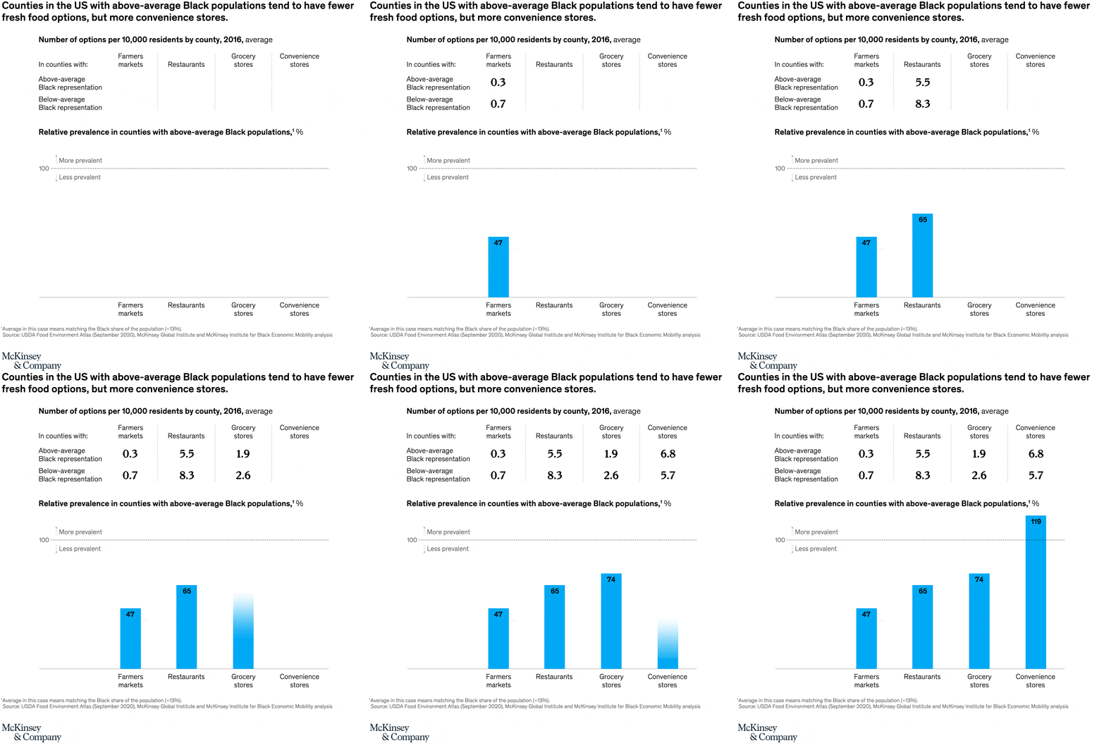
Two-part comparison chart combining a small table-style panel and a single-series bar chart.
Layout / body structure
The chart is stacked top to bottom. Read the top comparison table first for the absolute number of food-access options per 10,000 residents, then move down to the bottom bar chart for the relative prevalence view against the 100 baseline.
What is being compared
The top panel compares counties with above-average Black representation against counties with below-average Black representation across four outlet types: farmers markets, restaurants, grocery stores, and convenience stores. The bottom panel compares how prevalent those same outlet types are in above-average Black population counties relative to the overall average.
Measurement system
The top panel uses counts of options per 10,000 residents, while the bottom panel uses relative prevalence percentages with 100 as the average benchmark. Bars below 100 indicate less prevalence than average, and bars above 100 indicate more prevalence than average.
Visible structure inside the graphic
The top section is laid out like a two-row, four-column table with the outlet names across the top and paired values for above-average versus below-average Black representation. The lower section is a four-bar chart with a dotted 100 reference line, directional labels for more or less prevalent, and category names printed beneath each bar.
Main takeaway from the visual
The chart shows a clear split between fresh-food access and convenience access. Counties with above-average Black populations have fewer farmers markets, restaurants, and grocery stores than their counterparts, but they have more convenience stores than average.
Key standout values or extremes
In the top panel, above-average Black counties show 0.3 farmers markets versus 0.7 in below-average counties, 5.5 restaurants versus 8.3, 1.9 grocery stores versus 2.6, and 6.8 convenience stores versus 5.7. In the bottom panel, relative prevalence is 47 for farmers markets, 65 for restaurants, 74 for grocery stores, and 119 for convenience stores, making convenience stores the only category above the 100 benchmark.
Controls / sequence, when applicable
This is a static chart image with no in-chart controls to operate.
Companion media, when applicable
There is no separate companion audio or video; the chart image is the full visual on this page.