Source page: McKinsey & Company
Commentary
Wanted: Culturally competent doctors
Healthcare | North America | Diversity & Inclusion
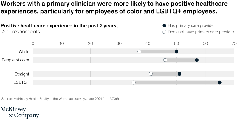
January 25, 2022 – Employees who said they had a preferred primary care provider (PCP) were more likely to have had “delightful” healthcare experiences; employees of color in particular were around 11 percentage points more likely to have had “delightful” experiences if they had a PCP. Why? A doctor, nurse, or physician’s assistant who is culturally competent can understand and validate personal identities and experiences.
To read the article, see “Income alone may be insufficient: How employers can help advance health equity in the workplace,” December 3, 2021.
customizer here
Visual form
Horizontal dot-plot comparison chart.
Layout / body structure
The chart is arranged as four horizontal rows on a shared 0-to-70 scale, split into two topical pairs. Reader compares the White and people-of-color rows first and then the Straight and LGBTQ+ rows beneath them, reading the filled and hollow dots within each row as the two provider-status conditions.
What is being compared
The chart compares the share of respondents reporting a positive healthcare experience in the past two years. It compares those shares by demographic group and by whether the respondent has a primary care provider.
Measurement system
The horizontal axis is percent of respondents. A filled dark dot represents respondents who have a primary care provider, while a hollow dot represents respondents who do not have a primary care provider.
Visible structure inside the graphic
Each row contains two dots placed on the same pale track, so the distance between the hollow and filled markers shows the effect of having a primary clinician. The rows are labeled White, People of color, Straight, and LGBTQ+, making it easy to compare both race and identity gaps in one chart.
Main takeaway from the visual
The chart shows that having a primary clinician is associated with a better healthcare experience for every group shown, and the gap is especially pronounced for employees of color and LGBTQ+ employees. The filled dots consistently sit to the right of the hollow dots, so the advantage of primary care is visible across the entire chart.
Key standout values or extremes
The White row sits at roughly 50 percent with a primary clinician versus about 37 percent without one, and the People of color row sits around 57 versus 46 percent. The Straight row is around 51 versus 41 percent, while LGBTQ+ respondents show the widest spread at about 65 percent with a clinician versus roughly 35 percent without one.
Controls / sequence, when applicable
This is a static chart image with no in-chart controls to operate.
Companion media, when applicable
There is no separate companion audio or video; the chart image is the full visual on this page.