Source page: McKinsey & Company
Commentary
Waves of workforce change
Future of Work | Productivity
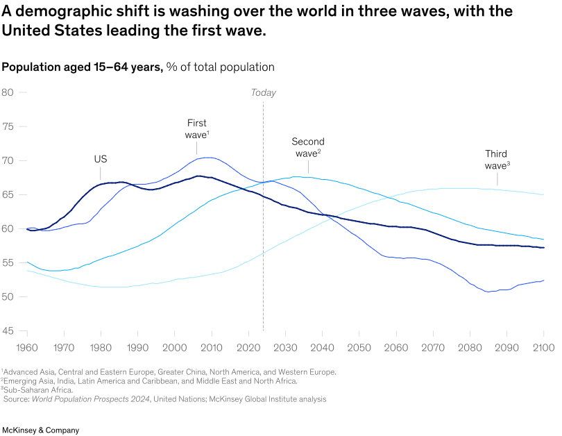
May 28, 2025 – Global working-age populations are expected to peak in three waves, with the first wave including the United States and nearing its end. US demographic shifts are contributing to workforce shortages, which could accelerate, McKinsey Global Institute Partner Anu Madgavkar and coauthors note. This comes as the United States is already falling short in terms of labor productivity in sectors such as construction, healthcare, and small businesses.
To read the article, see “Empowering the US workforce,” April 28, 2025.
customizer here
Visual form
Multi-line chart. The chart uses several time-series lines to show how the working-age share of the population rises and falls across different demographic waves.
Layout / body structure
The page presents a single chart that runs horizontally from 1960 to 2100, with a vertical marker for today and wave labels placed directly above the relevant lines. The reading order is left to right across time and then back to the annotations that identify the first, second, and third waves.
What is being compared
The chart compares the share of the population aged 15 to 64 across the United States and broader regional groupings associated with the first, second, and third demographic waves. It is a comparison across time, regions, and the timing of each region’s demographic peak and decline.
Measurement system
The y-axis is the percentage of total population aged 15 to 64, and the x-axis runs from 1960 to 2100. The colored lines and direct labels matter because the chart relies on line position rather than bars or panels to show which wave is earlier, later, higher, or flatter.
Visible structure inside the graphic
The graphic is built from several colored lines that crest at different points in time, plus a vertical dashed marker labeled today and text labels that mark the first, second, and third waves. The separation between the lines after their peaks is what makes the sequence legible: the earlier-wave lines crest first and slope down sooner, while the later-wave lines climb later and stay elevated deeper into the forecast.
Main takeaway from the visual
The visible takeaway is that the global workforce shift is staggered rather than simultaneous. The first-wave economies peak earlier and are already declining, the second-wave group peaks later around the 2030s, and the third-wave group continues rising much further into the future.
Key standout values or extremes
The first-wave line reaches roughly 70 percent in the 2000s before falling, the second-wave line crests in the upper-60s around the 2030s and then trends down, and the third-wave line rises toward the mid-60s late in the century. The US path sits near the earlier crest and clearly leads the first wave ahead of the later groups.
Controls / sequence, when applicable
This is a static chart image with no in-chart controls to operate.
Companion media, when applicable
There is no separate companion audio or video; the chart image is the full visual on this page.